

Why You Need to Stick to Your Principles
 When we start thinking beyond mobile devices, we can see that screens are quickly becoming ubiquitous.
Whurley at UNTETHER.talks alluded to the post-mobile era, where everything will become a screen. That’s why I was absolutely intrigued when I first heard of FITC’s SCREENS 2012 conference at DevTO 15.
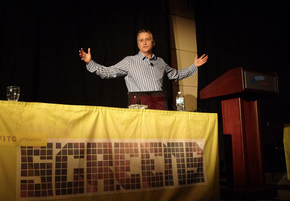
FITC held their SCREENS conference this year in the North Building of the Metro Toronto Convention Centre. Let’s get right into some ideas that were being shared.
DESIGN AS AN ESSENTIAL MARKETING FOUNDATION
The Working Group’s Chris Eben pointed to various apps as being constrained by poor design. He also illustrated the fact that design is possibly one of the greatest marketing tools of your app; a good design will be the factor that causes users to rave about your app to all their friends; it is a factor that can cause users to turn into evangelists.
No amount of promotional pushes can save a poor functional design. There have been tons of apps that have launched at huge events, like SXSW, only to reach the deadpool months after its debut (i.e. Hashable). Conversely, a good functional design can carry a product in spite of a lack of promotional efforts from the creators.
Case in point: Microsoft technical evangelist Frédéric Harper spoke at Screens 2012 about web design that was responsive to users’ preferences (i.e. having a website that doesn’t require users to scroll both horizontally and vertically while they’re on a mobile phone or tablet device).
Harper highlighted some remarkable sites like HTML 5 Shelf, A List Apart, Illy Issimo, and Design Made in Germany as websites with great designs to the audience. Now, I’ve shared these excellently-designed sites with you.
Good design can also be a competitive advantage; I’ve seen users migrating from Food Porn Daily to Gojee, due solely to a much more cohesive and aesthetically-pleasing user experience.
Some resources Harper shared include Screenfly, Hardboiled Web Design, and Firebug. One absolutely essential piece of content for you to check out would be Harper’s SCREENS 2012 slideshow, which is available on Slideshare.
Despite the importance of design, Eben reminded the audience of the standard promotional boost for apps. The marketing budget for top apps is at around $30,000 to $40,000 (which often goes into paid media/reviews, or PR & blogger outreach), and startups usually spend 14% of their time on marketing activities.
LEAN DEVELOPMENT TOOLS
Eben held a session centered mostly on agile development and its relation to design. He also raised the point of how the Lean Canvas is the new business plan to VCs and other investors.
This means creating minimum viable (or desirable) products. Eben advocates involving paper prototyping in order to get more feedback during the initial design stage. He, Furrow, and Harper all alluded to technology such as TestFlight, HockeyApp, AT&T’s ARO, and Flurry Analytics (free!) to hold controlled betas, test assumptions, measure learning, and conduct deeper quality assurance.
STICKING TO YOUR DESIGN PRINCIPLES
500px lead (and until recently only) iOS developer Ash Furrow talked about how he developed the stunning official 500px iPad app. He mentioned that one core principle behind the design, and behind 500px, is to always focus on the photos. That’s why there is no texture in the app; either there are photos, or there’s empty space to save from distraction.
He also touched on the notion of “good enough implementations”; whatever your function is, it has to be enough to wow the user—but it does not have to be perfect code.
Furrow touched upon a few tools he used in the process: Gengo for crowd-sourced translations, Crashlytics to measure crashes, and Google Analytics from day one to measure each user’s actions and clicks.
Google Analytics came in extremely handy to track where users may be getting lost. When users ran into trouble and confusion navigating to some functions, Furrow talked about his dilemma: it seemed like he had no choice but to break his design principle. He found a solution: instead of re-designing the interface, he designed a tutorial that highlighted a feature and how users can access it. This, for the most part, ended the user inquiries for that particular problem. If it’s not possible to make it more obvious, then show users how to do it.
SCREENS 2012 was an exemplar for the engaging lessons that all conferences should offer to their delegates. Its speakers offered excellent core principles, but were also careful to back the higher-level advice up with concrete, actionable, resources such as tools and case studies.
Similarly, SCREENS 2012 shared more evidence of ubiquitous computing, as well as design thinking melding together with business practice and execution.


